


OPERA OMAHA
Details
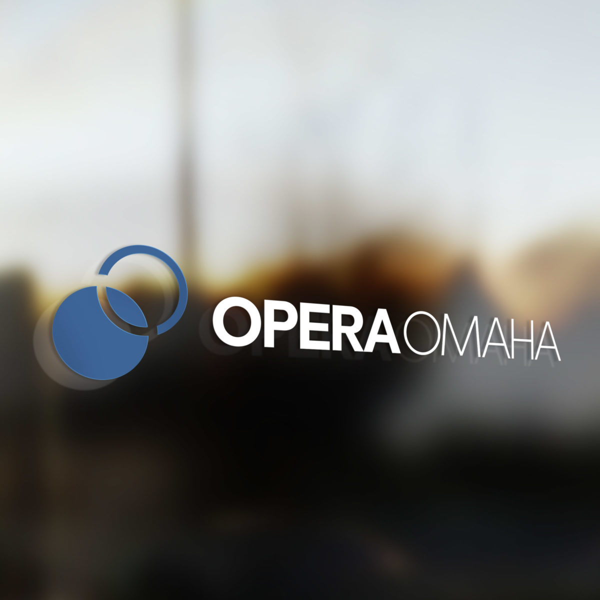
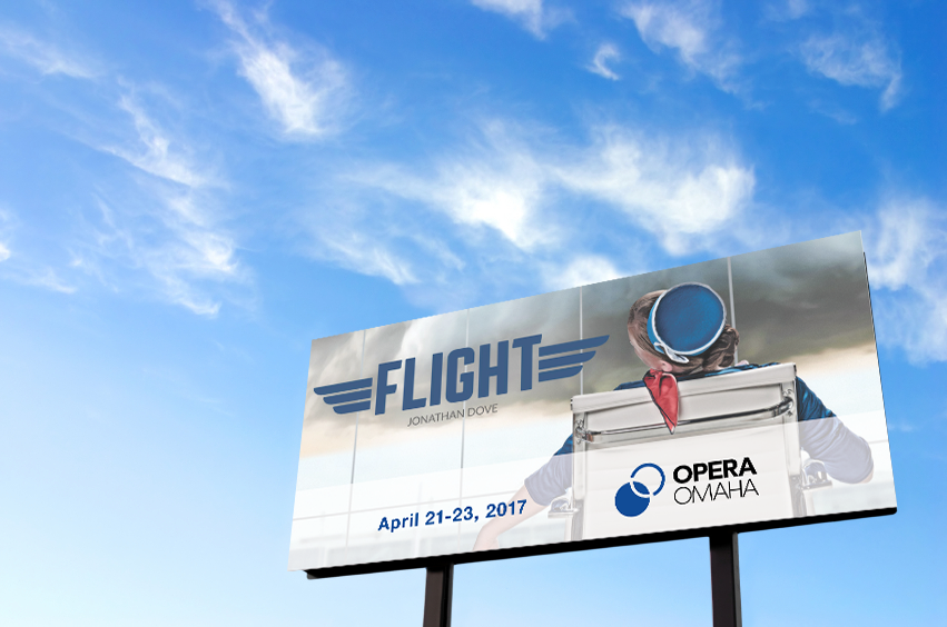
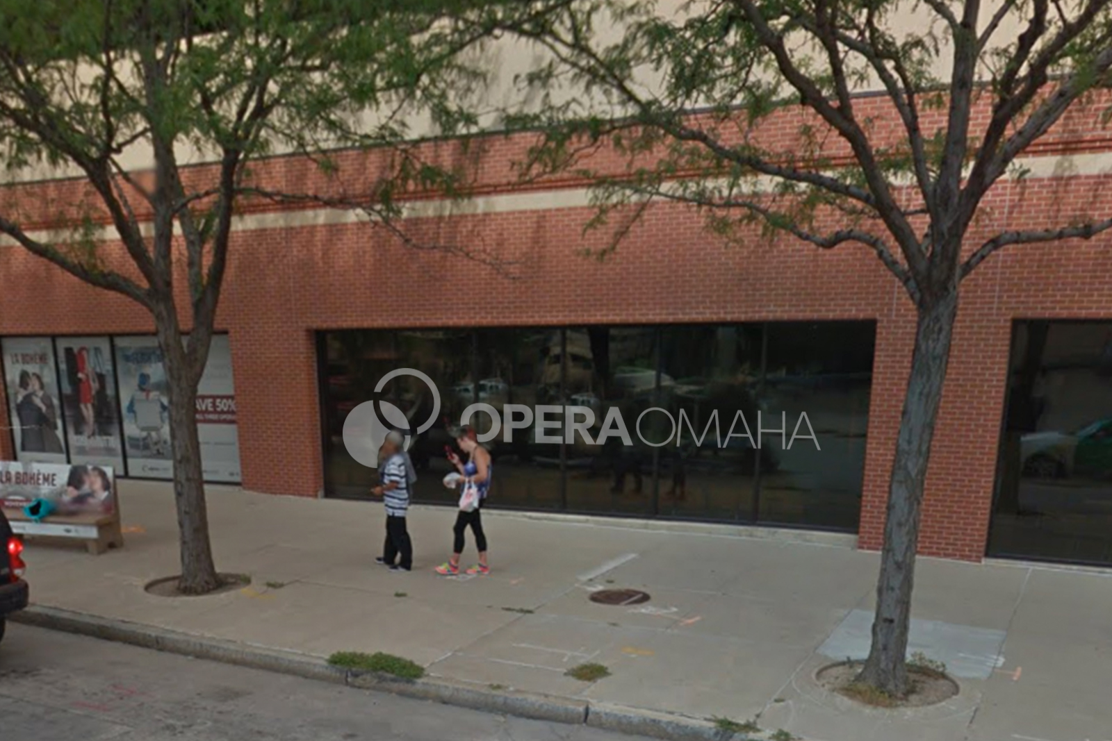
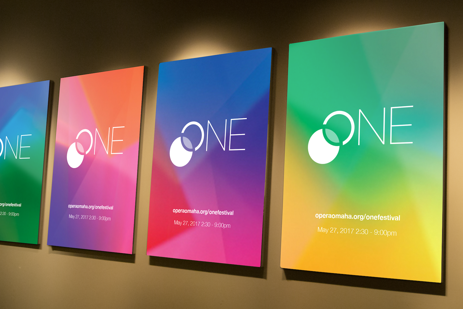
Opera Omaha was looking for a brand that will last through the ages, but also speaks to the decades of art and tradition that they draw from for their performances. This logo is the perfect mixture of two communities merging into one: Omaha & Opera.
Project Details
Client: Opera Omaha
Date: 2016
Skills: Branding
David Day Associates